
A vibrant, interconnected, and emotive brand identity and website design for a yoga and mindfulness community.
(UN)JAAN
LA PORTE, TEXAS
Impact Areas
HEALTH EQUITY
HUMAN RIGHTS
SOCIAL JUSTICE
Services
01 BRAND IDENTITY
02 Website deSIGN
03 WEBSITE DEVELOPMENT
04 illustration
Years
2021-2025

Brand identity
In 2021, the team at (un)jaan came to us to help bring their vision to life: a brand that feels inclusive, welcoming, and vibrant.
They needed an identity that felt inclusive, welcoming, and vibrant—something that would resonate deeply with BIPOC communities seeking restoration and belonging.
(un)jaan is a space for BIPOC individuals to feel supported, held, and empowered—a place for growth, connection, and restoration. We rooted the brand identity in these values, designing visual elements that reflect movement, physical connection, and community. Flowing lines were used to symbolize relationships, personal journeys, and the pathways we walk together.
The color palette draws from vibrant South Asian aesthetics, combining rich blues, greens, yellows, reds, and pinks. These colors create a sense of warmth, energy, and cultural resonance.
The logo was built in three parts: an icon representing connection and embrace; a wordmark with a mirrored “U/N,” symbolizing 180-degree movement and transformation; and a custom Urdu wordmark, integrated into full-size illustrated patterns. Typography was selected for its strength and softness—rounded edges and full-bodied curves creating a balance of presence and approachability.
The final identity feels bold yet tender, reflecting (un)jaan’s purpose as a space of collective healing and care.


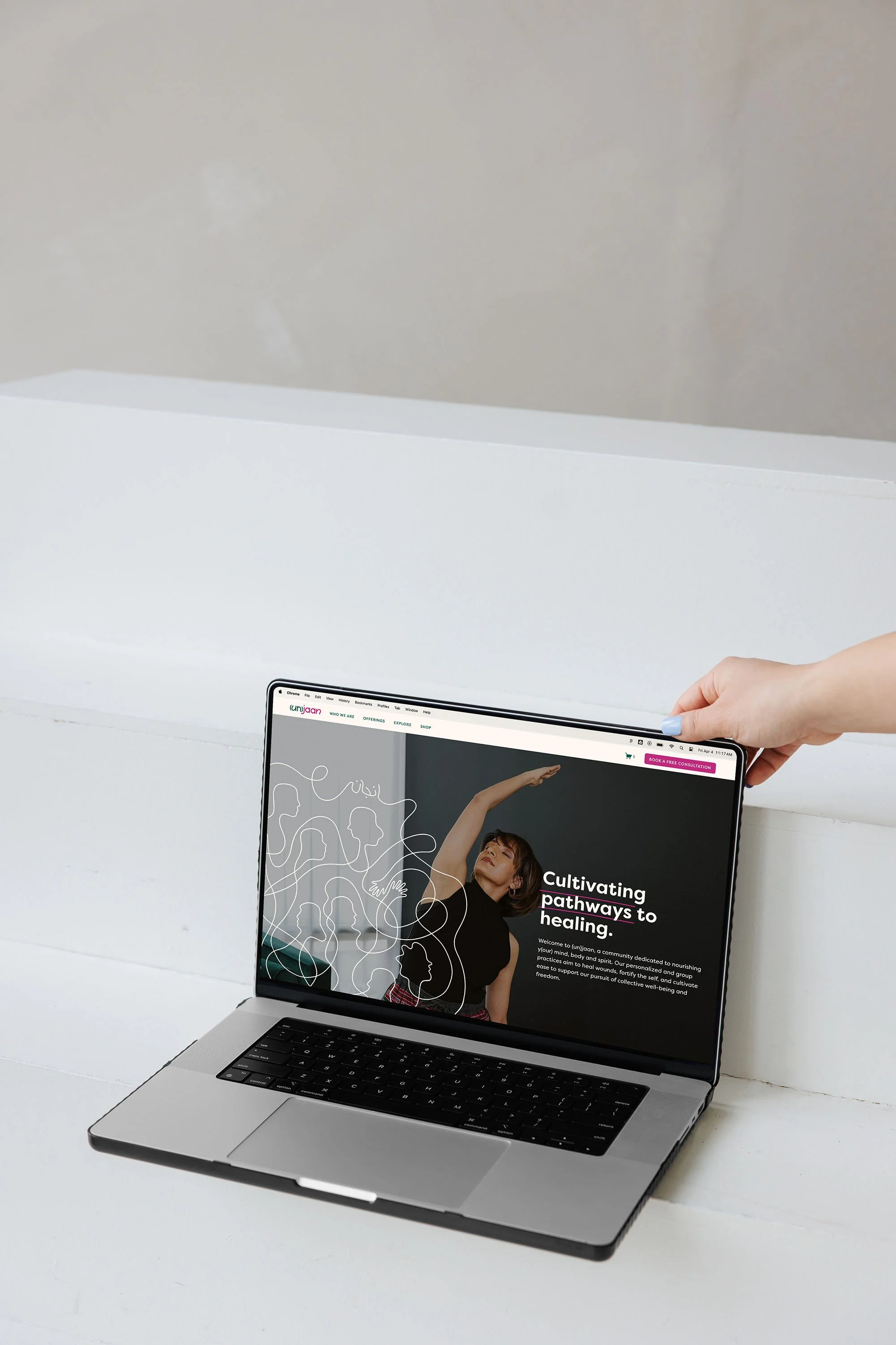
Website Design + development
We carried the heart of (un)jaan’s brand into every part of the website—building a digital space that feels just as warm, inclusive, and connective as the brand itself.
The design emphasizes softness and flow, using curved lines, generous white space, and organic layouts to evoke a sense of calm and openness. Illustrations and motifs from the brand identity appear throughout, reinforcing themes of connection, movement, and care.
Color played a central role: bold accents from the brand palette bring vibrancy to each page while maintaining a sense of grounding and clarity. Typography choices echo the brand’s balance of strength and softness, ensuring content feels both accessible and empowering.
We prioritized a welcoming user experience—clear navigation, thoughtful language, and an intuitive structure guide visitors through the site with ease. From the homepage to program details, each section was designed to hold space for reflection, belonging, and growth.
View the full website


WHAT THEY SAID“It's been an honor to work with Sereth! We couldn't have done it without you.
I am so grateful that I found Esther and Sereth Design at the beginning of my entrepreneurial journey. When I came to Esther, I only had ideas about the work I wanted to do and how I wanted people to feel. She listened attentively and created a branding identity which captured both the essence and potential of my business, (un)jaan. Throughout the branding process, she incorporated my feedback, asked powerful questions, and created stellar branding assets all of which set me apart and up for success. Fast forward a few years, I was in a position to revamp my website and knew that I had to work with Esther again. She remembered so much about my brand and held me accountable to producing the content necessary for the website all the while taking so much initiative to build and add components I didn't even know we needed. We recently just wrapped up this fun 6-month engagement, and I couldn't be more prouder of the new website. I enthusiastically and without reservation recommend Esther for all branding/website needs. She is SO brilliant, skilled and compassionate and an absolutely joy to work with.
— Hiba Haroon • (un)jaan • La Porte, Texas