Atlas Therapy • New York, NYProgress-Focused Therapy
01 Brand Identity02 Brand Strategy03 Website Design04 WEBSITE DEVELOPMENTAtlas Therapy is a solutions-focused therapy and counseling practice. They guide individuals and couples to help skill-build and drive sustainable change.
In 2024, Atlas enlisted Sereth to help guide them on their branding and web design journey. Our goal was to help build a system that provides a clear vision, personality, and lasting influence for their future.
Exploring the Possibilities
The primary icon was designed to represent a globe with moving parts in it. As we began exploring and playing with what movement could look like within the circle, we knew we wanted it to feel organic, contain different weights, and represent kinetic energy. We tested variations including a style of “A” from the Atlas wordmark, cell-division, plant growth, river ripples, and bounding energy waves.
We were most drawn to the abstract nature-inspired designs and refined a version that felt most like an abstract globe. The icon we landed on perfectly encapsulated movement, energy, and attempting to expand beyond the boundaries set before us.
THE DESIGN MOODBOARDSKILL-BUILDING
PROGRESS
INSIGHT
SUPPORT
EMPATHY
CURIOSITY
GUIDANCE
SKILL-BUILDING PROGRESS INSIGHT SUPPORT EMPATHY CURIOSITY GUIDANCE
Navigating Design Elements
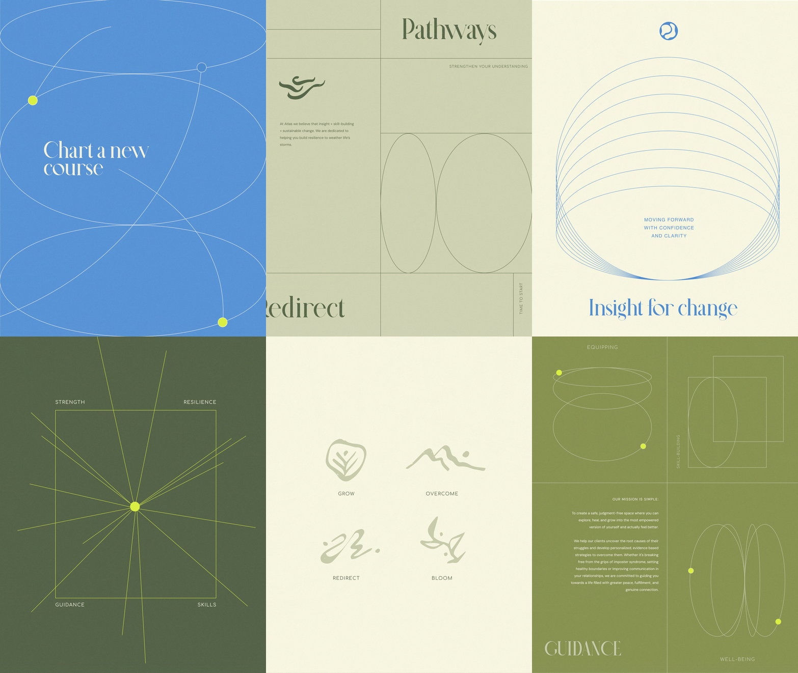
Throughout the brand we wove the brand’s story through iconography and elements. Pulling from atlas maps and charts, we used grids, lines, circles, and outlines to create unique shapes and layouts. We play with the idea of moving from Point A to Point B, expanding beyond our bounds, and use aysemmetry to balance structure with play. Small circles move along the lines, symbolizing the journeys.
Organic illustrations supplement the brand as iconography. We took an organic approach to these illustrations to break the structure of the grids and tie back to the fluidity of the primary icon. The drawings are often left open-ended and unfinished, alluding to each individual’s ever-evolving journey.
A Nature-Inspired Color Story
Our color story was inspired by mother nature and the vibrant and dynamic beauty of our planet. Earthy greens symbolize thriving forests, fertile lands, and renewal, grounding the design in nature. A deep, vibrant ocean blue evokes the vastness and mystery of the world's waters, a reminder of exploration and discovery. The neon yellow adds a touch of modern energy and innovation, representing the sparks of creativity and possibility across our communities. Together, these colors embody the balance between nature’s calm and its boldness, a tribute to the world as seen through the lens of an atlas or globe.
A Holistic Digital Experience
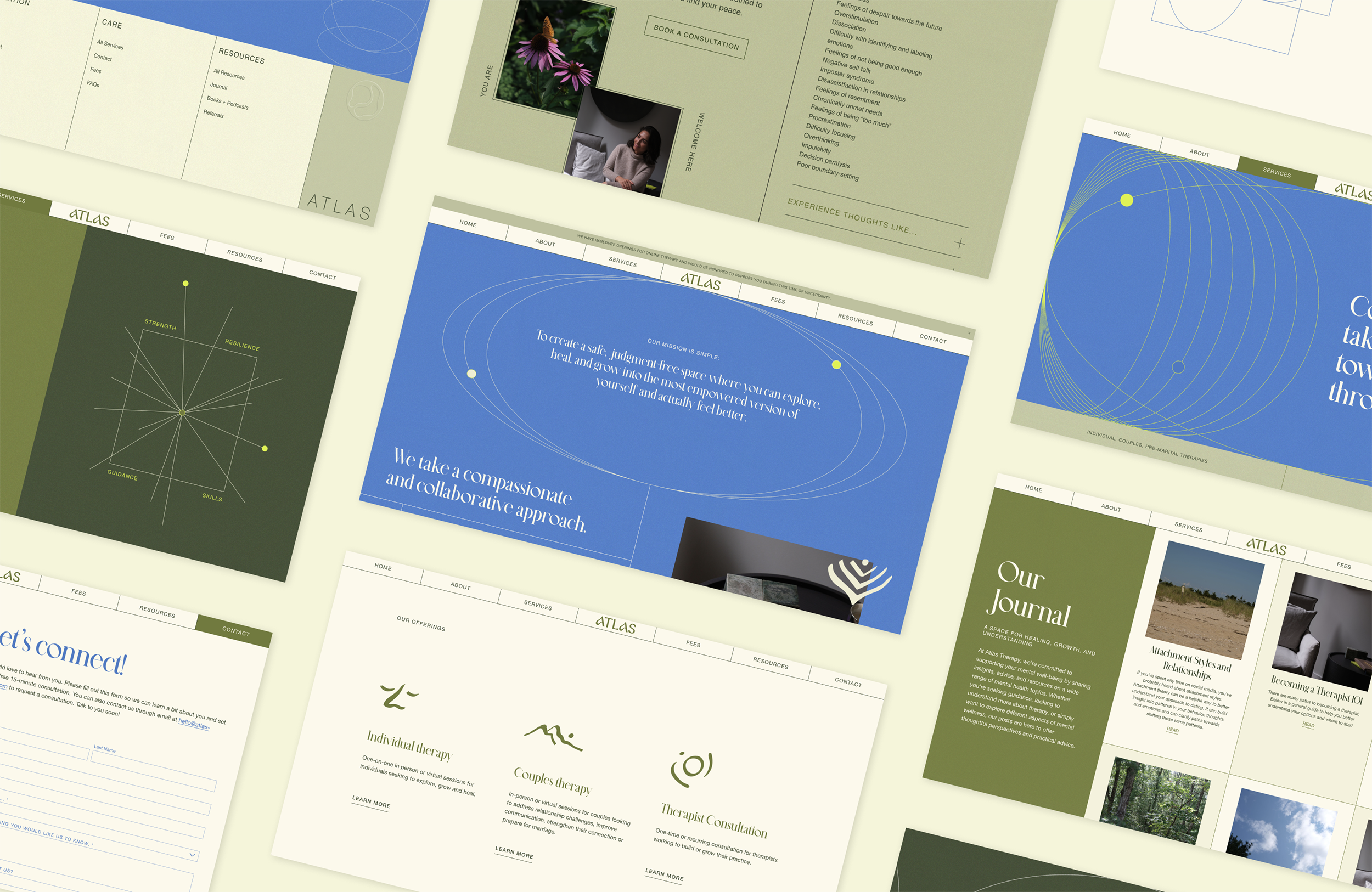
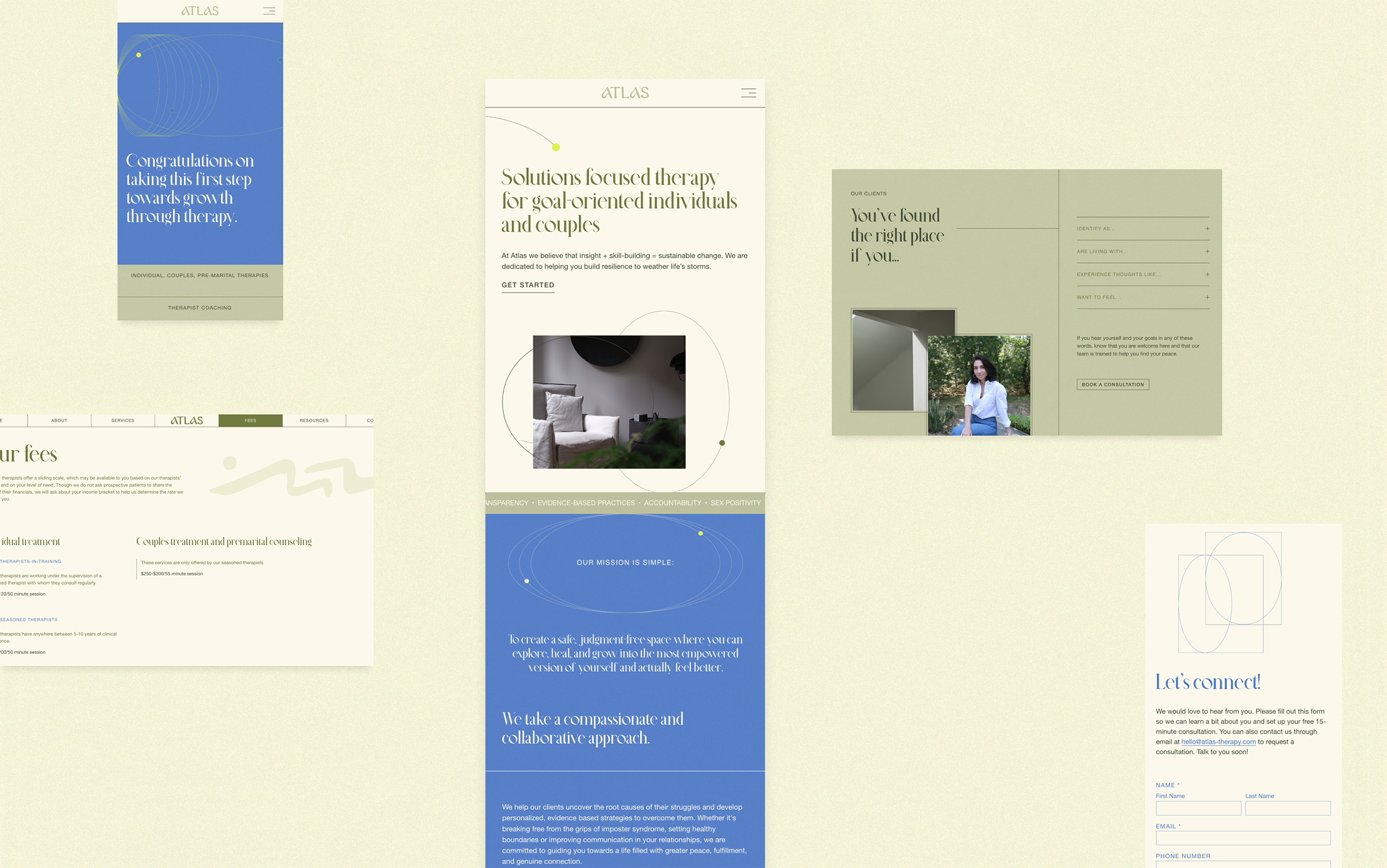
With all the brand elements in place, we set out to craft a dynamic and energizing digital experience that truly reflects Atlas’s mission. The website was designed with intentionality to not only showcase the wide range of therapy services and valuable resources but also to tell Atlas’s story in a way that resonates. Every element, from the layout to the colors, was chosen to invite individuals and couples to feel seen, supported, and encouraged as they begin their journey toward personal growth and healing. The site serves as a welcoming gateway, guiding visitors through the steps of their therapeutic journey, empowering them to take the first step with confidence and clarity.


WHAT THEY SAID
“Working with Esther has been an absolute dream. She has taken my thoughts and turned them into something intentional and beautiful.
Her process for gathering my ideas was incredibly thorough and so helpful in helping me really formalize my thoughts around branding, marketing, target audience, etc. Esther's ability to take a mishmash of ideas and turn them into exactly what I had envisioned and more will never cease to amaze me.
She is thoughtful, pays attention to detail, is fun, follows-through, is responsive, and is the perfect person to bounce ideas off of. She felt like a true collaborator. Esther has been a huge asset to me, to my brand and to my business. I feel so thankful to have found her and I cannot recommend her enough!”
— Janine Cheng • Atlas Therapy • New York City, New York


