Elite23 • Chicago, ILDreams Drive Her Destiny
01 BRAND STRATEGY02 CREATIVE DIRECTION03 LOGO DEVELOPMENT04 BRAND IDENTITY05 DIGITAL TEMPLATESIn the spring of 2024, we were brought on to guide Elite 23, a Chicago-based mentorship and development organization for young girls, through their rebrand. Our team helped them refine their brand strategy and visual direction, refining their story and unearthing a fresh future for the organization.
From the get-go, their commitment to excellence, igniting passion, and leaving a life-long positive impact on girls in the city was palpable. "These girls have big dreams, they just need to see the possibilities." was a statement that stuck with us. The possibilities for their lives are endless, colorful, bright. We wanted to craft a visual identity that represented ever-evolving dreams.
Kaleidoscope of Dreams
Enter: the kaleidoscope.
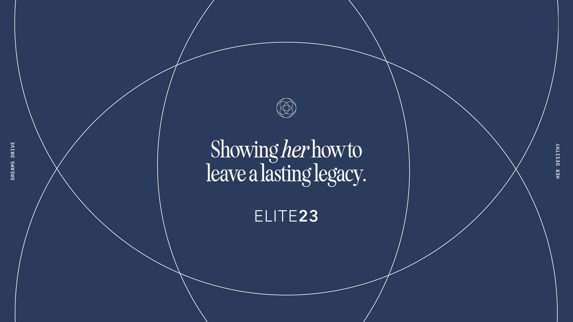
The kaleidoscope is constructed with two or more reflecting surfaces (or mirrors 🪞) tilted to each other so a beautiful pattern is shown. This representation was so perfectly suited for Elite 23, as women mentor girls and reflect aspirations, lived experiences, and encouragement back and forth. The kaleidoscope also represents the multitude of ways any one idea could be represented, how any dream could come to fruition, how vibrant and lively they could be.
CONNECTION
SUPPORT
LEGACY
COMMUNITY
GROWTH
CONNECTION SUPPORT LEGACY COMMUNITY GROWTH
THE DESIGN MOODBOARDDesigning for Growth
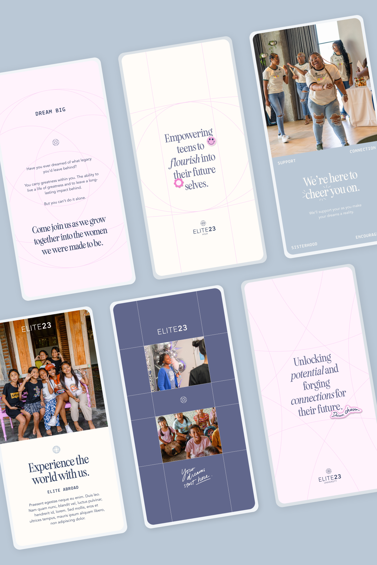
With the kaleidoscope as our beacon, we build an expandable design system that could naturally grow with the organization's multi-faceted programs. We created a marker for each initiative built as an alternate kaleidoscope window. As programs are added to the organization, they each can explore a new kaleidoscope frame.
This system allows for creativity for each new program while maintaining consistency.
Framing the Brand
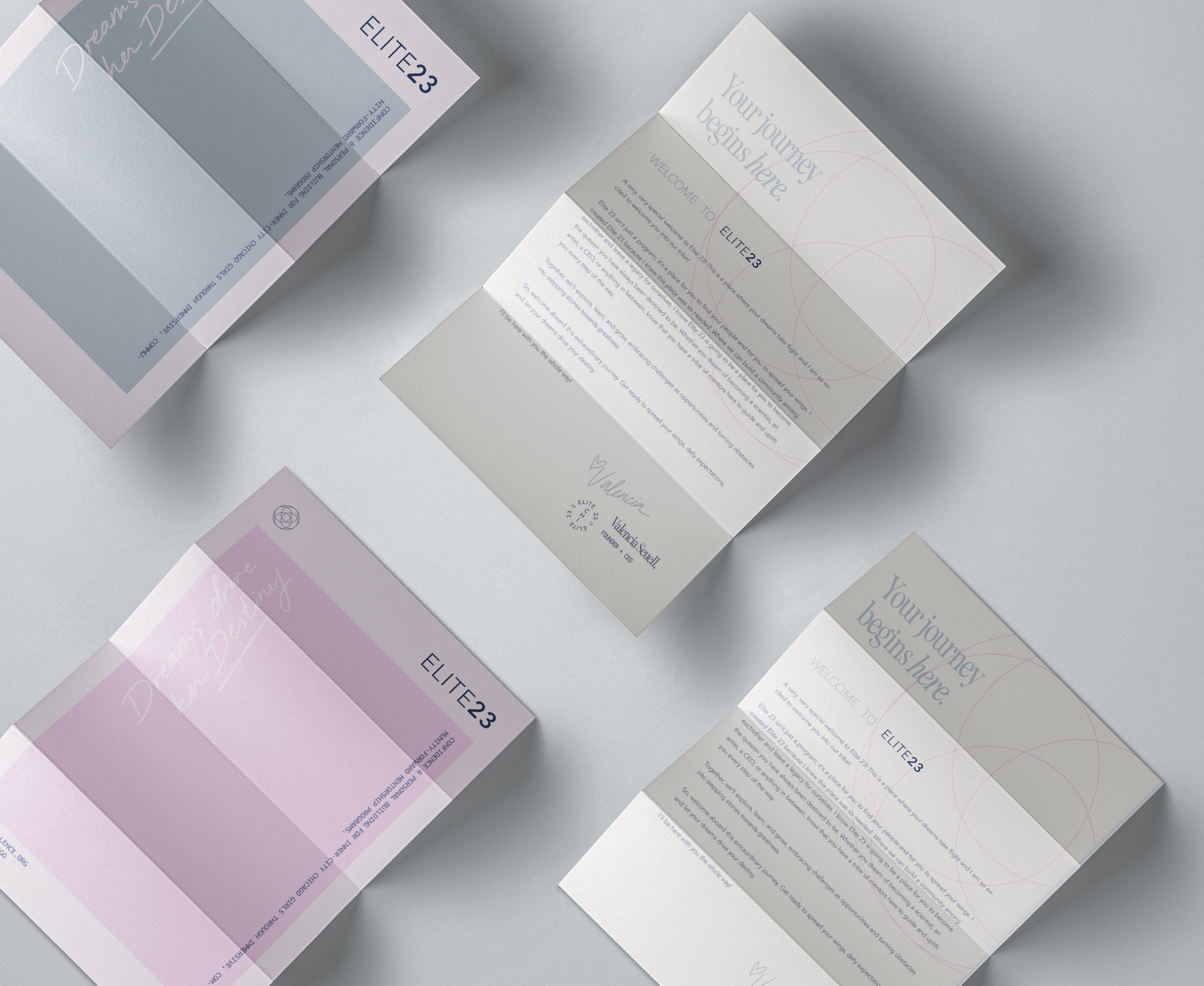
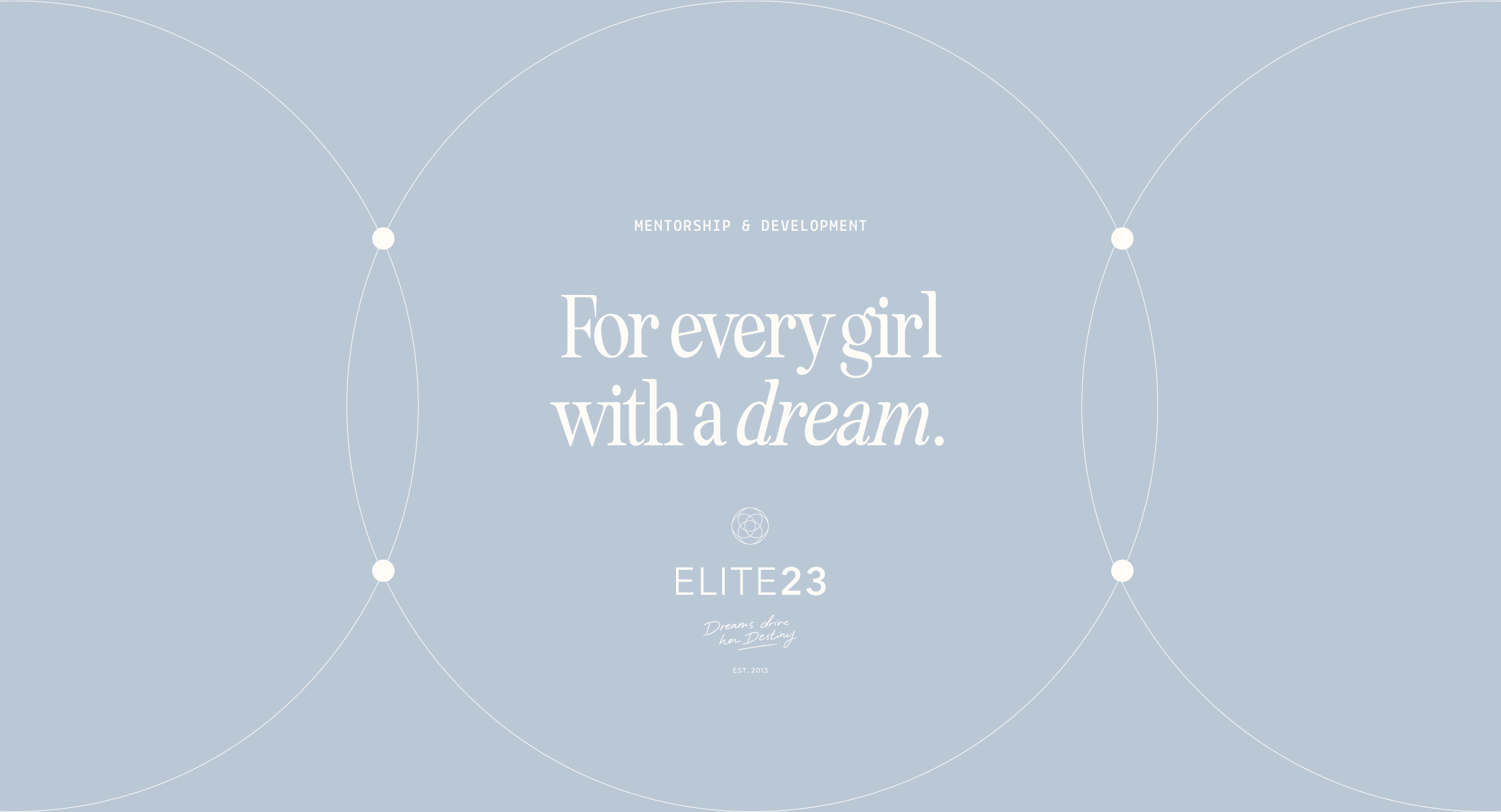
The kaleidoscope manifests through the branding beyond the icons through patterns, expanded shapes blown out, windows for photography, and grids.
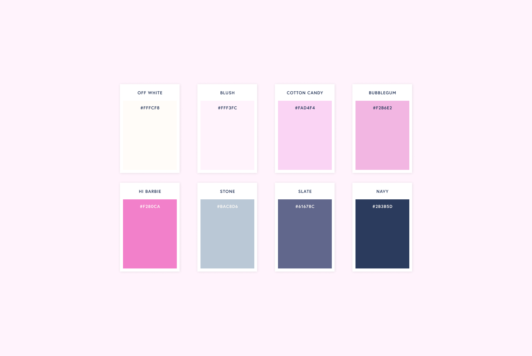
Beyond the kaleidoscope, we merged the remaining parts of the brand identity through the feminine, refreshing color palette that grounds the brand while maintaining a level of calming energy, the playful stickers, and the typography signifying confidence whilst bringing in a whim of nostalgia.
WHAT THEY SAID
“You nailed it! I can see a lot of where we can go with this [new direction].
It’s so us — intertwining the sophistication and idea that ‘we got this’ and an ‘elevated experience’ with humility and playfulness… Thank you for your dedication to our story.”
— Valencia Seuell • Elite 23 • Chicago, IL


