LAS PALMAS STUDIO • ATLANTA, GEORGIAMoving Stories with Fresh Perspectives
01 WEB DESIGN02 SQUARESPACE DEVELOPMENTLas Palmas Studio is a collective of creative women formed to help women- and minority-owned storytellers share diverse and distinctive narratives through a lens of curiosity and wonder. They are good people that want to make a difference through creativity and art and work with companies that want to do the same.
Las Palmas Studio came to us in need of a new website that showcases their brand aesthetic and production portfolio in an engaging way.
Our project with them was to create a website home that is fun, energetic, and a touch of weird.
Between 70s Euphoria and Post-Modernism
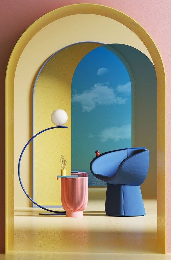
The ask from Las Palmas Studio was to make their website live between 70s euphoria and post-modernism and to feel: happy, irreverent, and sooooo not boring!
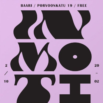
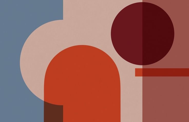
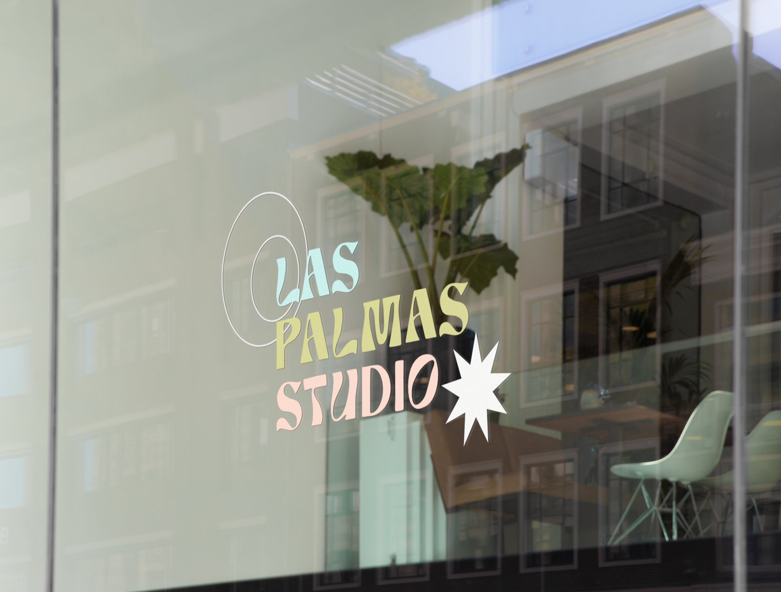
To encompass all these qualities, we incorporated a vibrant and bold color palette with contrast and usage of monochromatic space as well. Our typography selection was meant to be groovy, warm, and inviting. We also brought in fun retro-style shapes to pull the aesthetic together.
FUN
CURIOSITY
STORYTELLING
MAGIC
WONDER
FUN CURIOSITY STORYTELLING MAGIC WONDER
THE DESIGN MOODBOARD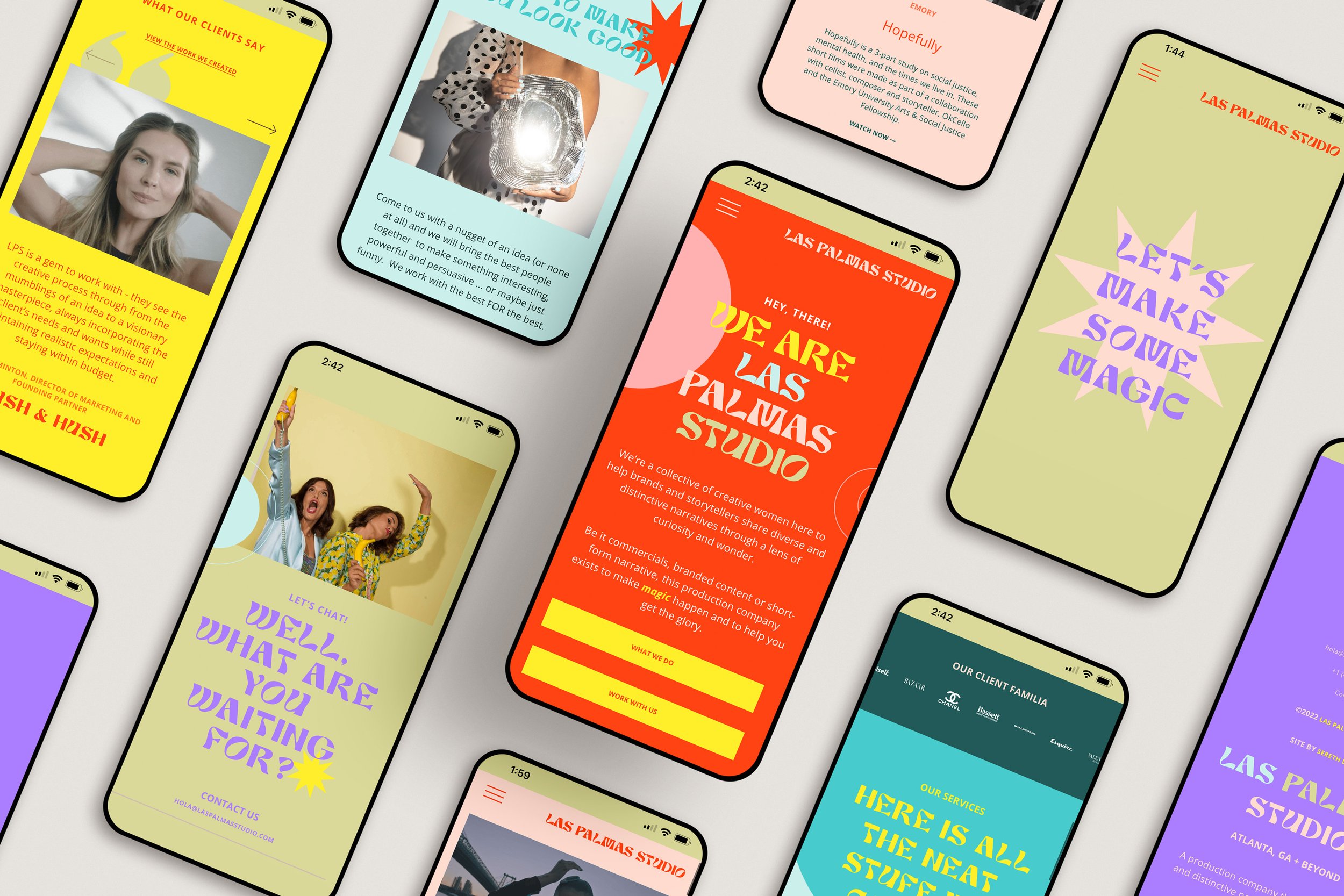
Color and Complexion
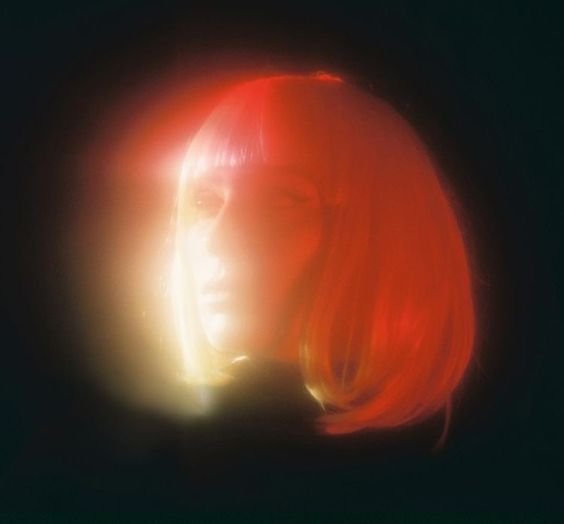
The most important calling for Las Palmas Studio is to highlight and showcase diverse voices and talent in the advertising and production industry. Because of that, one of our tasks was to ensure that all the colors that we incorporated into the website complemented all skin tones.
We opted for a vibrant, generous color palette to ensure that there was a color that suited every piece of imagery and video included. Additionally, each placement of shape, type, and color was strategically placed to keep the focus on the content while still incorporating the fun vibrance of Las Palmas’ brand.

Moving Images + Hover Effects
Las Palmas Studio’s work is 100% video. Therefore, their website had to have moving images so that each space could draw the viewer deeper and deeper into each story. To incorporate this, we clipped sections of their pieces to create short-form content that was easily digestible. Additionally, as you can imagine having video constantly is quite jarring and overwhelming to the eye. This is why we opted for hover-states where the GIFs would only play when the mouse is over the image. A perfect solution.
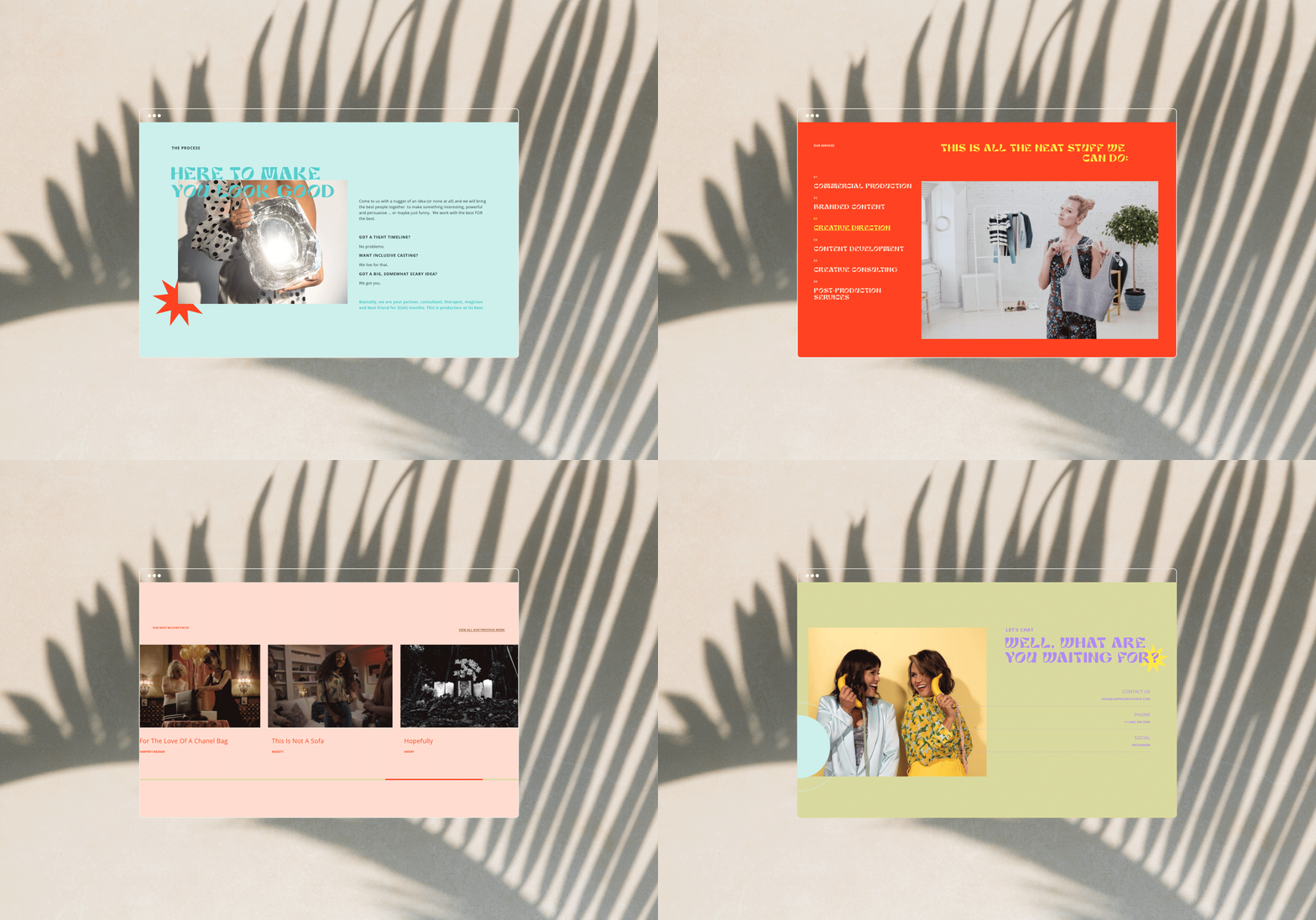
Hover below to scroll through the website.
WHAT THEY SAID
“We came to Sereth Design with a lot of big ideas and they met us at every turn with creative insight, innovation and can-do attitude.
Designing a website for your brand is a very personal and daunting task. Esther totally got out vision and made our dreams come into reality. She was always extremely communicative and always delivered on schedule. It was a 10 out of 10 for us. We will return to Esther with any and every design project without a doubt.”
— Anna Lyle and Gabriela Arp Díaz • Las Palmas Studio • Atlanta, Georgia


