lavender + Twine • Chicago, IllinoisSharing Joy-Filled Moments Together
01 BRAND STRATEGY02 BRAND IDENTITY03 packaging design04 COPYWRITING05 brand photography06 web design07 squarespace developmentLavender + Twine was conceived because of the deep desire to connect with people and incite joy in everyday activities. Lisa Zitella was inspired by the slow, easy days she spent with friends and family in Italy, sipping caffé with a simple treat — and she desperately wanted to bring that to her U.S. home. She wanted to capture the essence of unwinding and experiencing joy-filled moments with food. And ALSO — clean, delicious, and well worth the calories.
In early 2022, Lisa enlisted Sereth Design to establish Lavender + Twine as a brand: and one that is a modern all-natural twist on the authentic flavors of the Mediterranean. We helped Lavender + Twine develop their brand strategy, brand identity, photography, packaging, and finally: their website. Their design system was built around indulging people in the experience of L+T, experiencing joy, and connecting with one another around a simple afternoon coffee.
When Two or More are Sipping
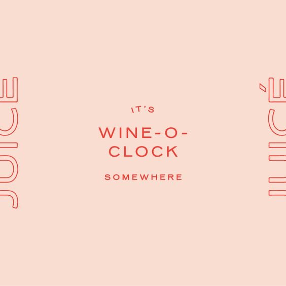
During our conversations with Lisa, we were drawn to the idea that delicious baked goods are not just about the eating experience - but rather: the eating with others. About sitting around a table, swapping stories, laughing, and enjoying life. It invokes the feeling of cheer, intimacy, family, comfort, and joy. We sought to bring all those feelings into the story of Lavender + Twine, a business built during a hard time, whose mission was to bring happiness to others by providing an item people could sip a glass of wine or caffé together over.
FAMILY
INDULGENCE
COMFORT
AUTHENTICITY
JOY
FAMILY INDULGENCE COMFORT AUTHENTICITY JOY
THE DESIGN MOODBOARDFull-Bodied Delight
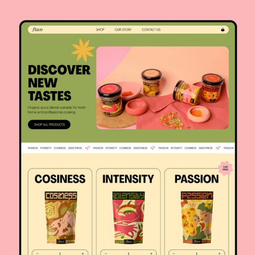
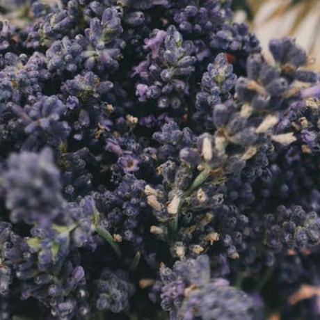
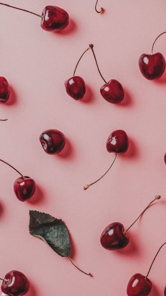
Through the brand design, we wanted Lavender + Twine to feel full. Full of excitement, energy, joy - and richness of flavor. The brand color palette was developed to be rich in color (particularly the cherry red + deep lavender) to symbolize the flavorful tastes in natural ingredients, paired with colors inspired by nature (the Amalfi Coast, the sunset, pistachios, and sifted flour). The letterforms creating the Lavender + Twine logo were built around the full-bodied effect and customized to mimic the twist of twine as well as the ties of friendship.

If We Could Eat a Picture
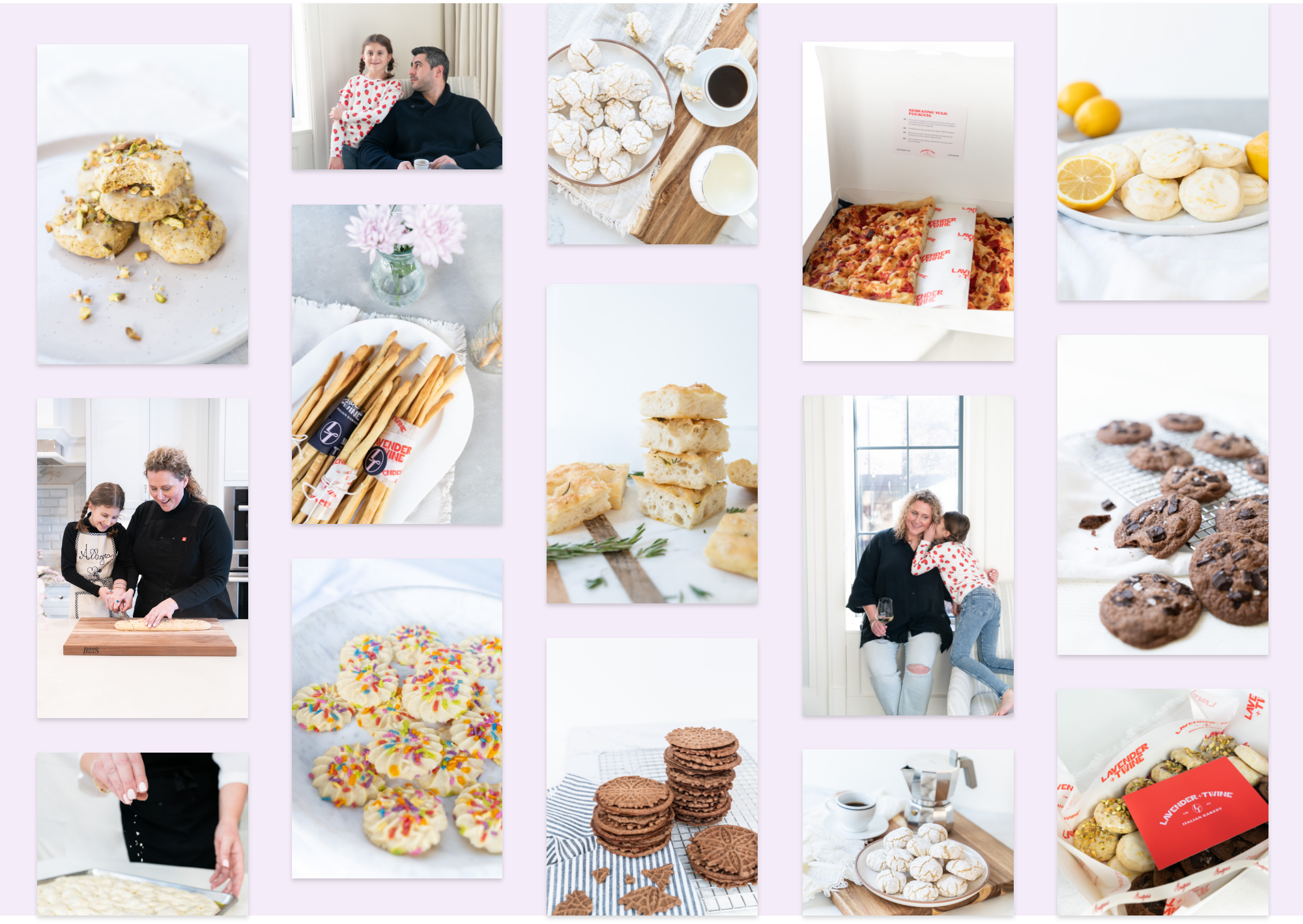
…we would eat these. We worked with a local Chicago photographer to comprise a gallery of over 100+ photos full of eye candy. We photographed every item that is on the Lavender + Twine menu, as well as portraits of Lisa and her family. Our goal with the photography was to make the photos feel like you’re at Lisa’s home — beautifully crafted with perfect messes. We kept the style bright and airy as we wanted it to feel fresh and clean, like the ingredients and how people feel after eating an L+T goodie.
Sustainable and Versatile Packaging Design
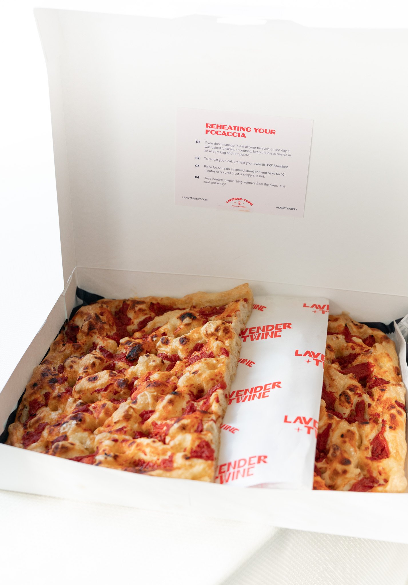
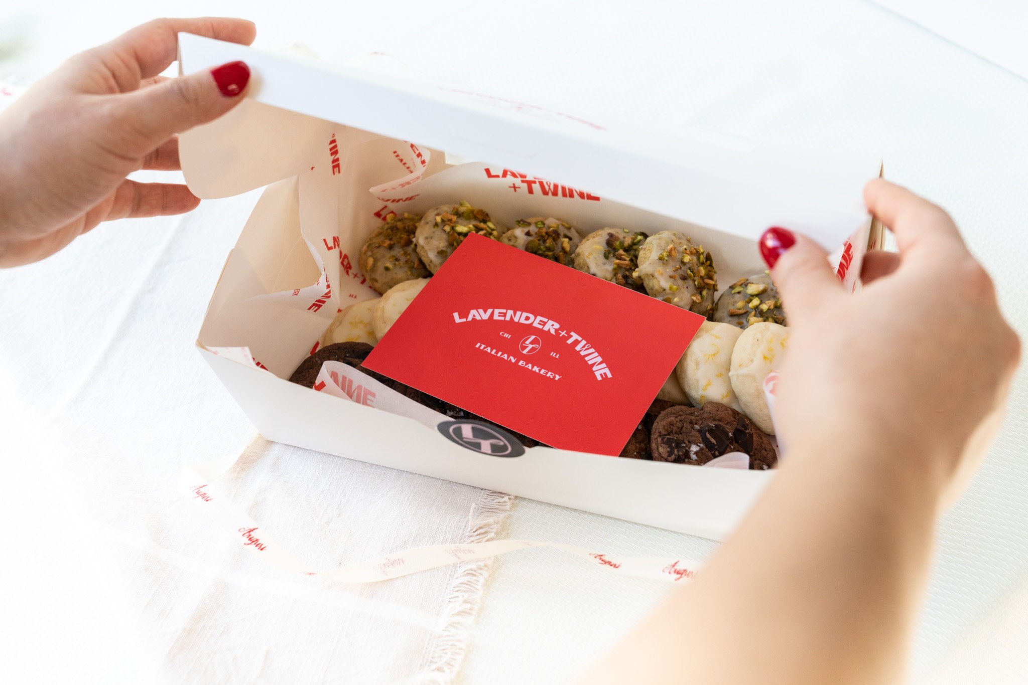
Our goal with Lavender + Twine’s packaging was to leave as little footprint as possible. We sourced many custom boxes, stamps, stickers, and tissue paper and ultimately found food-safe and earth-safe options. Our options left us with bare-boned boxes that were versatile to play with stamps, stickers to write flavors + expiry dates on, cards from recycled paper, food-safe wax paper with our printed pattern, and ribbon to tie it together. Each element was able to be repurposed for all of the boxes and mix/matched so that we never wasted a piece.
A Website That Delights
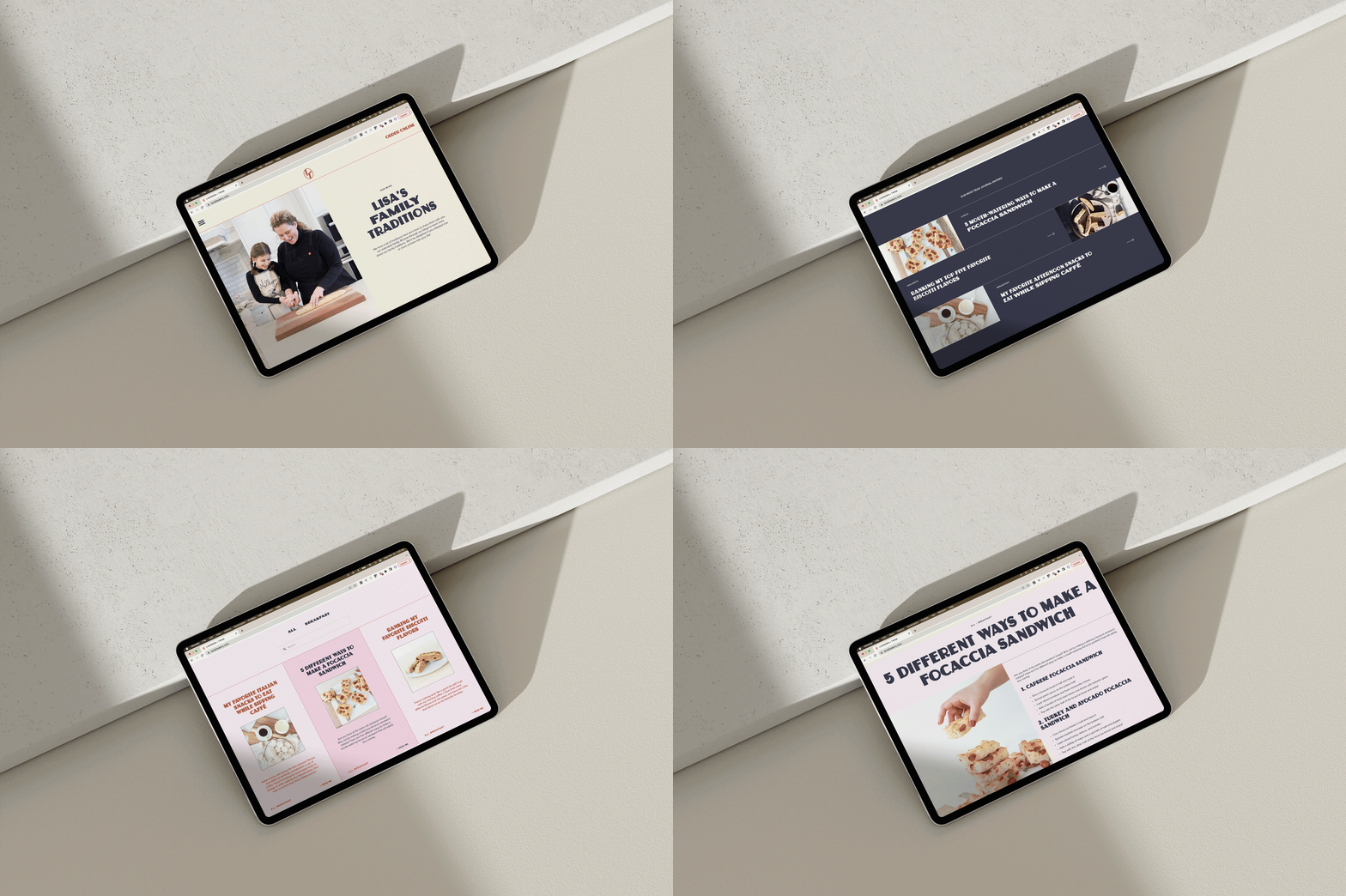
Lavender + Twine’s website needed to capture the hearts of our viewers and make their stomachs growl immediately on loading the homepage. That’s why throughout the site, we sought to make the photography (the goodies) the hero of the story. We styled many of the images to be able to hover to oval (the shape of our L+T submark) on hover for added flair.
We also added lots of interactivity and dynamic movement that invites the user to continue perusing. Photos combined with playful colors, bold layouts, and shapes, we mixed it up to invoke play — while still keeping the messages clean and clear. The site ties in the joy that we sought to share in the first place and helps tell the story of connection through indulgence.
Hover below to scroll through the website.
WHAT THEY SAID
“Collaborating with Esther from Sereth makes it feel like you are sitting down with a forever friend rather than working. She is so incredibly passionate about what she does, making the entire process deeply rooted in joy.”
— Lisa Zitella • Lavender + Twine • Chicago, Illinois


