How to Craft an Inclusive and Accessible Website Experience
In today's digital age, the internet has become an integral part of our lives, serving as a gateway to information, services, and opportunities. However, not everyone experiences the web in the same way. To ensure that the digital landscape is truly inclusive, web designers and developers must prioritize accessibility. So how do we do it?
Let’s talk about the significance of accessibility in digital and website design, touching on key aspects such as color contrasts, text size, alt text, and more.
Understanding Accessibility
Accessibility in web design refers to creating online content and experiences that are usable and understandable by individuals with disabilities. Disabilities can encompass a wide range of conditions, including visual, auditory, cognitive, and motor impairments. By prioritizing accessibility, we ensure that everyone, regardless of their abilities, can access and interact with digital content.
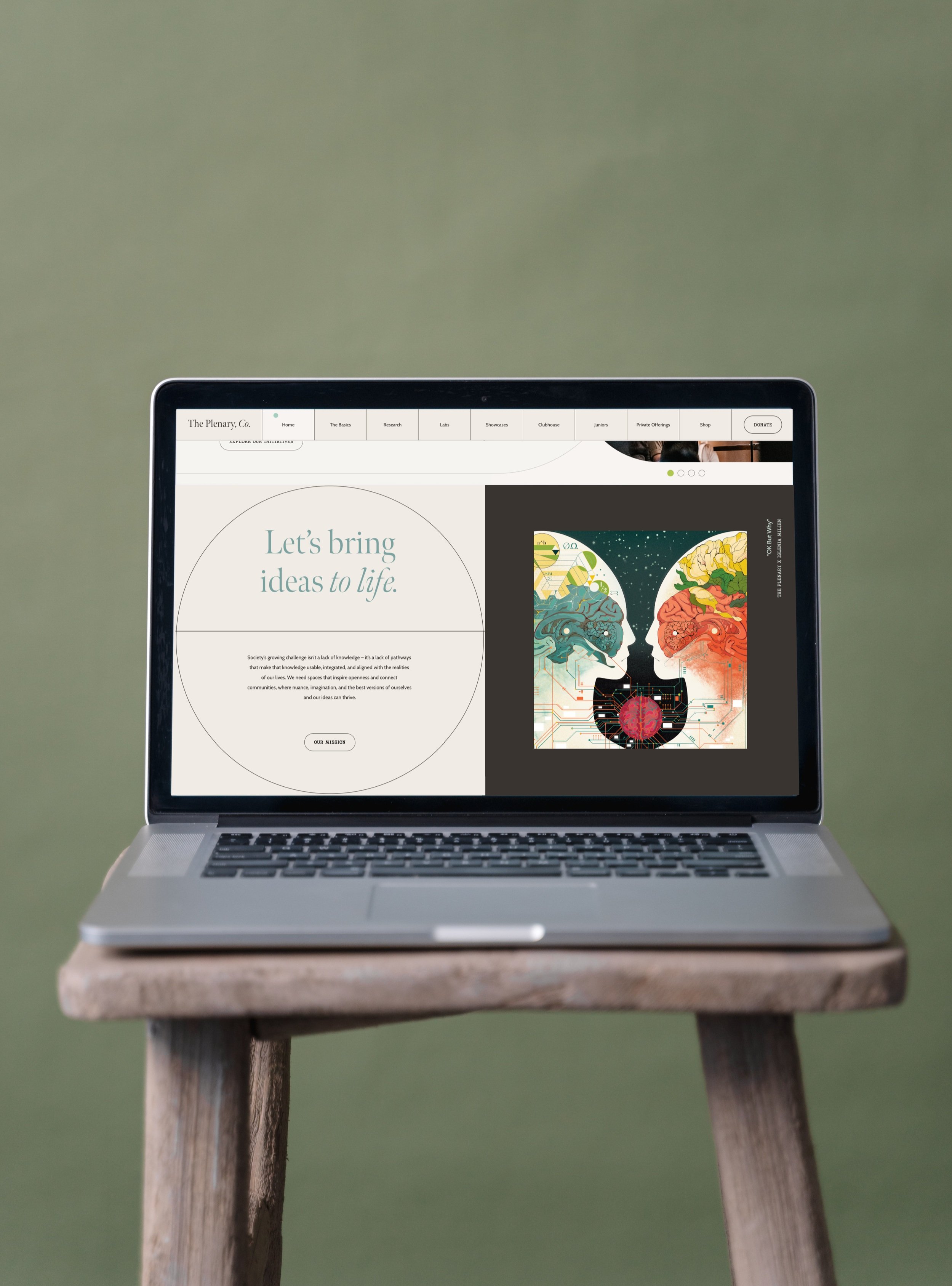
Client Example: The Plenary, Co.
Color Contrasts: The Foundation of Readability
Color plays a pivotal role in web design, affecting not only aesthetics but also usability. Ensuring adequate color contrasts is crucial, as it enhances readability for users with visual impairments. When choosing color combinations for text and backgrounds, follow these guidelines:
WCAG Standards: The Web Content Accessibility Guidelines (WCAG) provide specific recommendations for color contrast ratios. Check out WCAG to learn about minimum contrast ratios.
Testing Tools: Utilize online color contrast tools to check your designs for compliance. Tools like the WAVE Accessibility Evaluation Tool and Contrast Checker can help you identify any issues.
Size Matters: Text and Typography
Text size and typography significantly impact the readability and comprehensibility of web content. Here are some tips for making text more accessible:
Flexible Text Sizes: Use relative units like percentages or ems for text sizing. This allows users to adjust the text size according to their preferences without breaking the layout.
Clear Fonts: Choose legible fonts and maintain a reasonable line height (line spacing) to prevent text from appearing crowded or overlapping.
Avoid Purely Stylistic Choices: While creative typography can be visually appealing, ensure that it doesn't compromise readability. Make sure there's a balance between aesthetics and accessibility.
Client Example: The Plenary, Co.
Alternative Text (Alt Text): Describing Images
Images are a crucial part of web content, but they can present challenges for users with visual impairments. Alt text is a concise description of an image that can be read aloud by screen readers. Here's how to use alt text effectively:
Informative Descriptions: Alt text should convey the essential information and purpose of the image. If it's a decorative image, use empty alt text (alt="") to indicate its non-functional role.
Contextual Relevance: Ensure that alt text fits seamlessly within the surrounding content. It should make sense in the context of the page.
Avoid Redundancy: If an adjacent text element already conveys the same information as the image, you can use alt text sparingly or include a brief description.
Keyboard Navigation and Focus States
Many users rely on keyboard navigation instead of a mouse, making it crucial to provide a smooth and intuitive experience for keyboard users:
Logical Tab Order: Ensure that interactive elements on your website can be navigated in a logical sequence using the Tab key. Avoid elements that trap users in keyboard focus, making it impossible to exit.
Skip Navigation Links: Include "skip to content" or "skip to main menu" links at the beginning of your page for keyboard users to bypass repetitive navigation elements and jump directly to the core content.
Video and Audio Accessibility
Multimedia content, including videos and audio, should also be made accessible:
Transcripts and Captions: Provide transcripts for audio content and captions for videos. These not only aid users with hearing impairments but also benefit users in noisy environments or those who prefer reading.
Audio Descriptions: For videos with visual content that's critical to understanding, add audio descriptions to narrate the visual elements and actions.
Regular Testing and User Feedback
Web accessibility isn't a one-time task; it's an ongoing commitment. Regularly test your website with accessibility tools and gather feedback from users with disabilities. Incorporate their input to continually improve the accessibility of your digital platform.
Inclusive web design isn't just a legal requirement; it's a moral and ethical obligation to ensure that the digital world is accessible to all.
By implementing principles such as color contrast, text size, alt text, and keyboard navigation, you can create a more accessible and welcoming online experience for everyone. Let's work together to make the internet a place where no one is left behind!
If you’re looking for a website design studio to help you craft a powerful and accessible website, our team would be happy to help!
Let us help tell your story in the most thoughtful and strategic way. Fill out an inquiry form or hit reply to send us an email so we can start the conversations. We know you have a story to tell and lives to touch, let us help you get there.


