The Plenary, Co. • San Francisco, CaSpirited Ways to Explore Issues that Matter
01 Website STRATEGY02 UI Design03 UX Design04 Website DevelopmentThe Plenary, Co. is an art & science nonprofit that designs vibrant community experiences to unlock the insights and energy we need to create more beautiful, sustainable, and equitable futures.
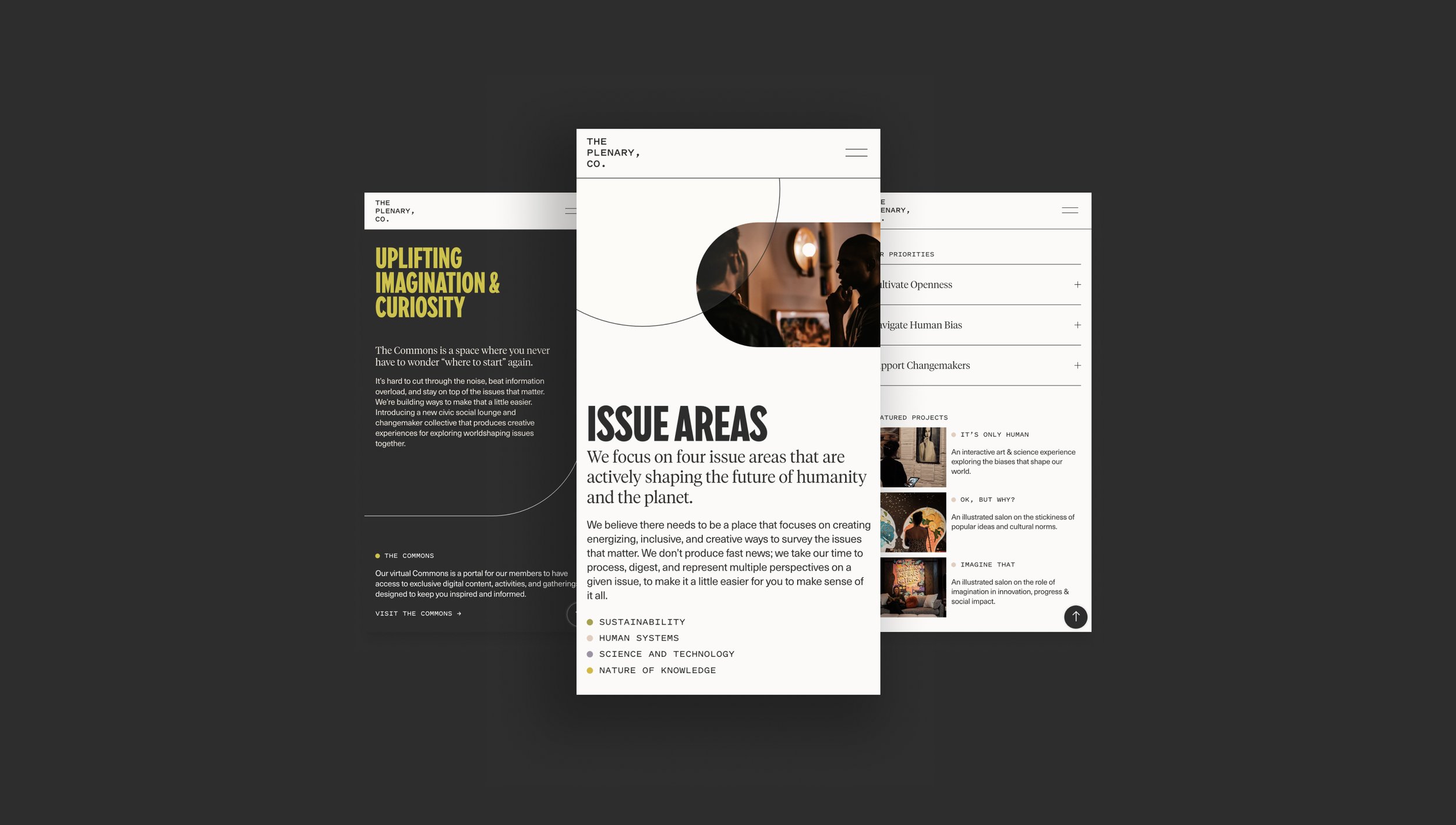
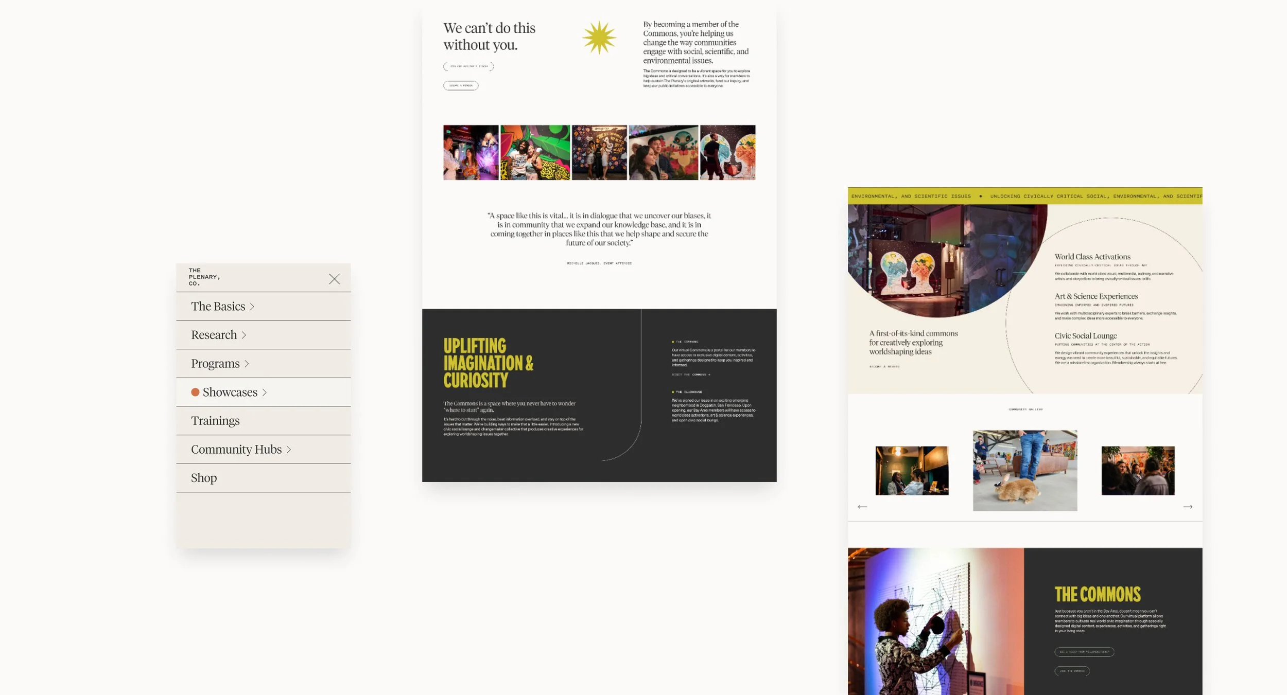
In 2023, we were brought in to help retell the story of The Plenary, Co. through strategic website design.
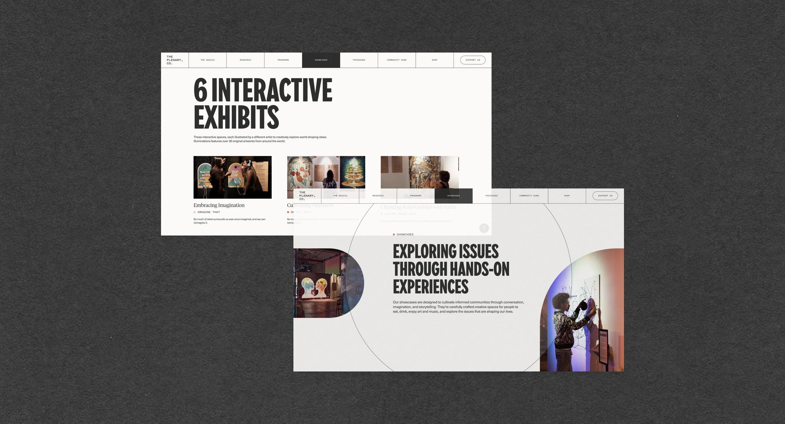
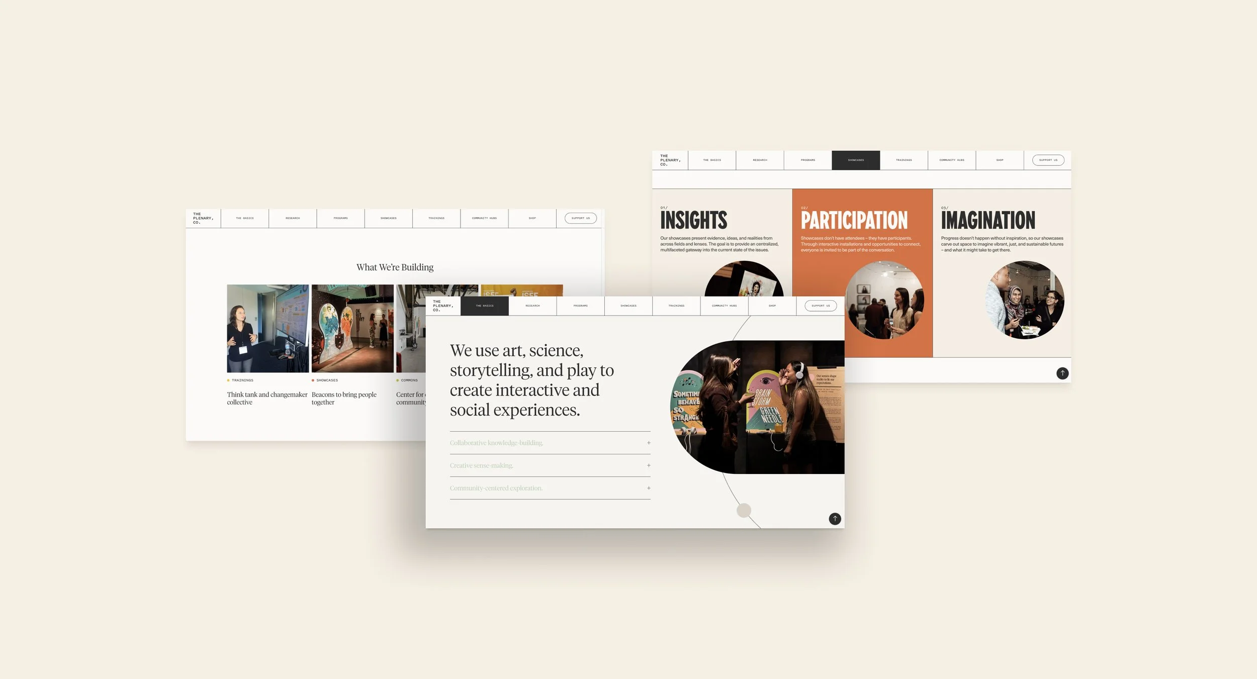
We dug into how to organize the content and many facets of the organization in clear ways, while conveying a sense of curiosity, learning, and excitement.
Our ultimate goal: make complex issues easy to understand and desiring of exploration.
A Beacon for Discovery
Our goal was to capture The Plenary, Co.’s energy so their outsides finally matched their insides. As we dove into the creative direction we found that at the core, The Plenary, Co. is a space to help individuals make sense of the complex issues of the world and society.
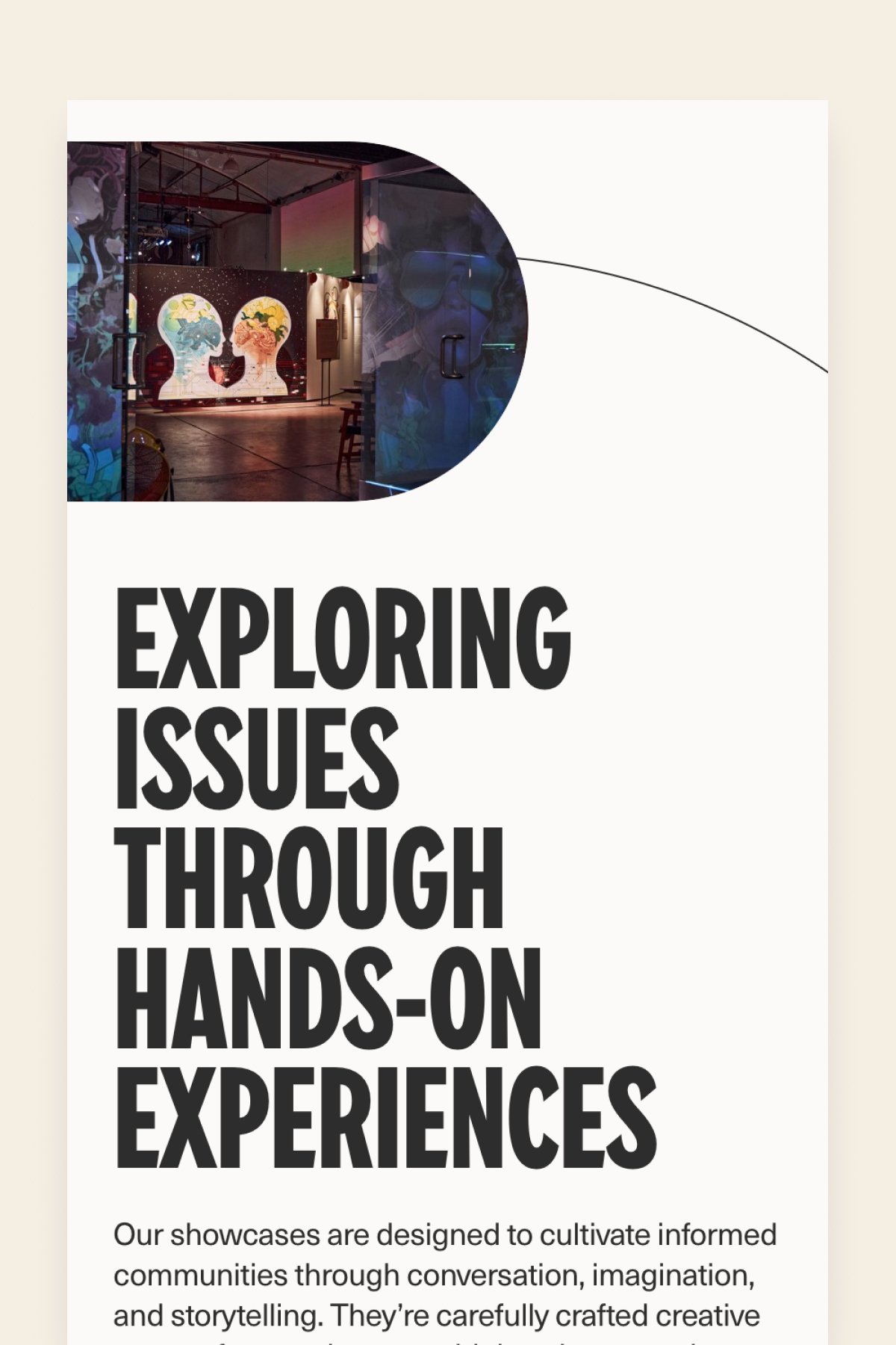
From the colorful and vibrant layouts to the melding of scientific-meets-modern design, we created a dynamic and kinetic brand experience. The overlaps of shapes, mono-chromatic colors, and spaciousness paved way for a feeling of expansion and innovation.
EXPLORATION
COMMUNITY
IMAGINATION
CURIOSITY
OPENNESS
DYNAMICS
KINETICS
EXPLORATION COMMUNITY IMAGINATION CURIOSITY OPENNESS DYNAMICS KINETICS
THE DESIGN MOODBOARDNavigating Complex Details
Our vision for the website was to create an online space that exuded a sense of boldness, spirit, and liveliness, all while delivering a wealth of detailed information. We recognized the challenge of presenting intense data and content in a way that wouldn't overwhelm visitors, but instead, inspire them to stay engaged and delve deeper.
Through thoughtful design and vibrant visuals, we aimed to infuse a dynamic energy into every page, making the journey through complex information not just informative but also enjoyable. Our goal was to offer a platform where users could navigate intricate details with ease, fostering curiosity and a desire to explore further, ultimately empowering them to make sense of the intricacies of our subject matter.
One viewer said, “I loved how it made me feel like you trusted me with complexity. You didn’t hold back on the hard-hitting information, but you packaged it in a way that made me curious and feel like you were meeting me exactly where I was.”
Interactivity and Play
We designed their website to reflects the curiosity and interactivity that beautifully pair with the experiences they create in real life. We pushed the boundaries of Squarespace to creative vibrant layouts that inspire play (such as hover sections, draggable sections, click-throughs, and nested areas) so a user never wants to stop scrolling.
View the live website.
Brand Guidelines + Extended Digital Materials
We supported the style guidelines development for the organization. We crafted language, rules, and structure for all the moving pieces and design elements. We also crafted brand-aligned layouts and a suite of templates such as decks, social media, reports, and more. Our work in building the guidelines and template suite was instrumental in ensuring that all elements—from typography to imagery—harmonized to tell a unified story across all touchpoints.
WHAT THEY SAID
“I looked forward to every meeting, both to see what brilliant creative solution you’d dreamed up and because you are such a warm and supportive creator.
We felt like a partner, not a client, and I think that collaborate approach comes through in a final product that is both stunningly designed and deeply aligned with the spirit of our organization.”
— Stephanie Fine Sasse • The Plenary, Co. • San Francisco, CA


